Poll: Box Art Brawl: #90 – Super Paper Mario

Box Art Brawl..? You’re sure you remember those words, and yet… It’s been so long, you’re not quite certain of what it all means or even who you are anymore.
Just kidding.
Yes, we’re back with a brand new Box Art Brawl! It’s been a minute, for sure – 7 whole months, actually! We’re excited to bring back the subtle art of pitting regional variants against each other to determine which territory has the fanciest, most eye-pleasingly, mouth-wateringly gorgeous box art around.
Back in August ’21, we checked out Chrono Trigger for the SNES, pitting Japan against North America and leaving poor Europe on the sidelines. North America’s more action-focused box art won the round comfortably, bringing in a whopping 69% of the vote.
This week we’re looking at the Wii release of Super Paper Mario, which incidentally celebrates its 15th anniversary this month! The game took the typical RPG elements that the Paper Mario series is known for and blended it with more traditional Mario platforming action.
So be sure to cast your vote in the poll and make your voice heard as we determine which Super Paper Mario box art is the super-est!
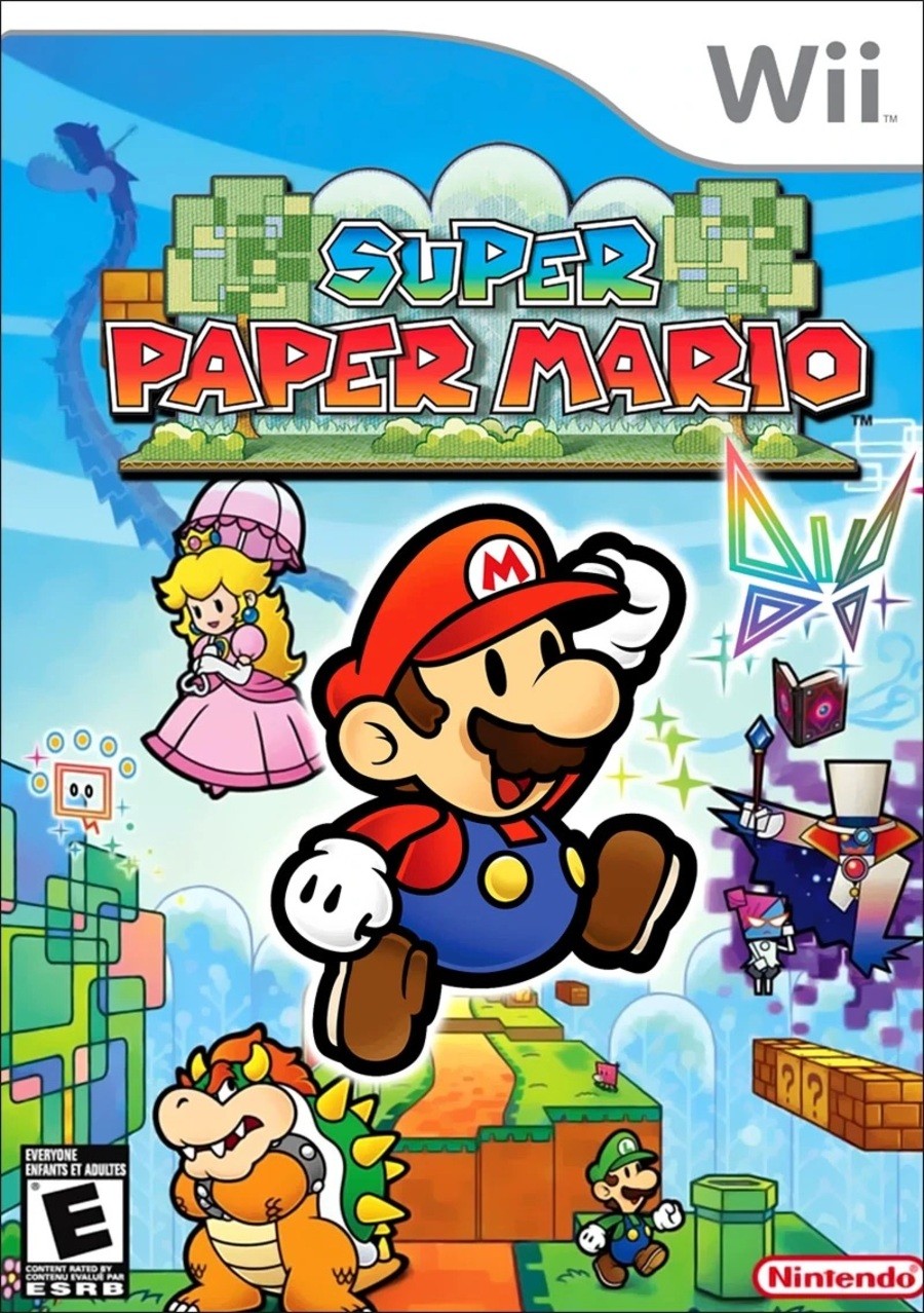
North America

Our first lovely box art is very Mario-esque, isn’t it? Lots of pretty colours bursting from the screen. We love the focus it puts on the terrain going off into the distance – almost reminds us of art classes in school when we learned about perspective.
Finally, we can’t help but notice how Bowser and Luigi are facing away from each other, almost as if they’ve reached the end of argument and simply can’t be doing with each other’s nonsense anymore. Love it!
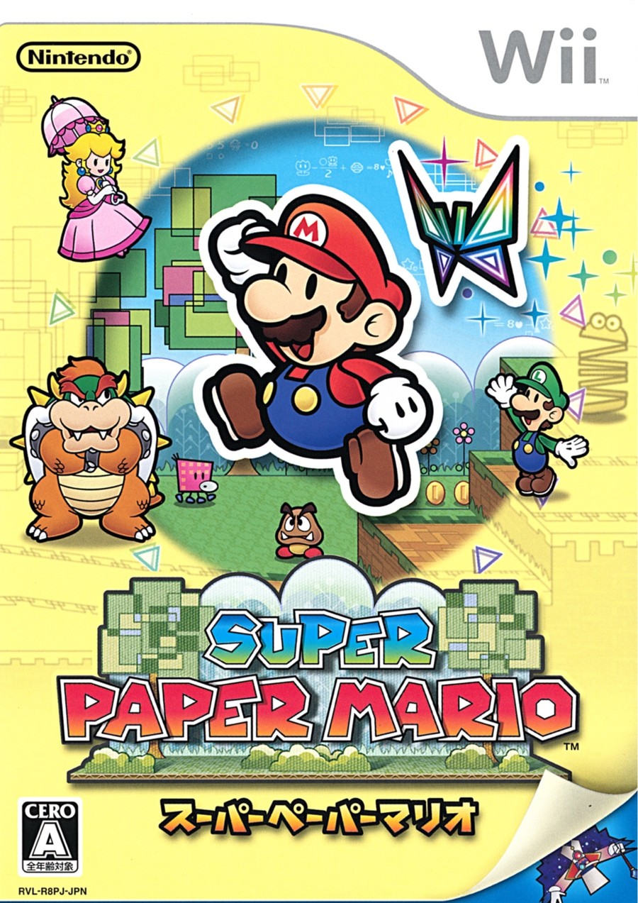
Japan

The Japanese box art for Super Paper Mario uses the same sprite for Mario himself, but the other characters have been altered slightly. Bowser is still sulking about something and Luigi’s off on the other side waving at him. We like to think that Luigi got the upper hand of whatever argument they were having and is now just goading Mario’s nemesis. Good ol’ Luigi!
In terms of composition, we’ve got a bit of a spotlight centred on Mario, with most of the box art given a creamy kind of colour. It’s also turned up at the bottom – like paper, wheeey – to reveal the dastardly Count Bleck.
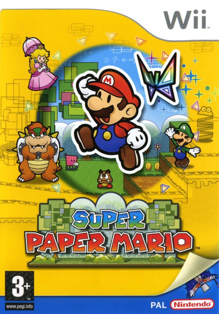
Europe

There’s not a great deal to say about this one as it’s very similar to the Japanese release in terms of the general look. The overall colour palette, however, has been darkened, with the deeper yellow colour reminding us of earlier Mario artwork like the Japanese release of Super Mario World, or the Super Mario Bros. 3 box art.
Its overall composition has been shrunk ever so slightly from the Japanese version, which looks to account for the inclusion of the ‘PAL’ and ‘Nintendo’ logos at the bottom. Whatever works, we guess!
Thanks for voting! We’ll see you next time for another round of the Box Art Brawl.


