Box Art Brawl: Duel #104 – Mario Kart: Double Dash!!
[ad_1]

Hi folks, and welcome to another edition of Box Art Brawl!
In last week’s edition, we threw Assault Suit Leynos / Target Earth into the ring, with the North American box art squaring off against Japan. It was a ruddy close one too, with Japan’s more restrained take on the game garnering 56% of the vote. It’s clear that plenty of you liked the more “out there” artwork for the North American release, however!
This week, we’ll be taking a look at Mario Kart: Double Dash!! for the GameCube (a game that we declared to be the best in the series, thank you very much), one of the more unique entries to the Mario Kart franchise. We’re going to lump North America and Europe together for this one, because while the two designs feature slight variations in their composition, they’re nevertheless a tad too similar to compete with each other.
Japan, on the other hand, showcases a vastly different box art design, and it’s going to be interesting to see which one you folks prefer!
But enough chat, let’s get on with the show.
Be sure to cast your votes in the poll below; but first, let’s check out the box art designs themselves.
North America / Europe
So as we mentioned earlier, Double Dash!! for North America and Europe feature very similar designs; in fact, the characters and environment are identical to one another, but the composition is slightly different, with NA’s version significantly more zoomed in. This means that characters like Donkey Kong and Diddy Kong have been moved to fall more directly behind Mario and Luigi, with Yoshi and Birdo pushed further to the left.
We’re not sure which design came “first” with these two, but we’re tempted to lean more toward NA on this one; the EU version has a lot more unused space that’s taken up by blue skies and green hills; it’s nice, but perhaps not as “punchy”. Either way, we’re not pitting these two against one another, but do let us know in the comments which one you prefer.
Japan

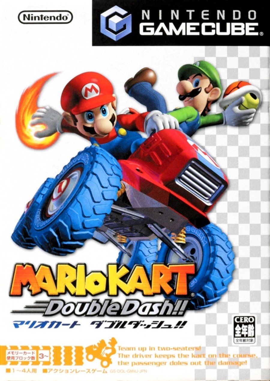
So the Japanese version of Double Dash!! is very different, showcasing Mario and Luigi in full glory against a white background with a checkered pattern running down the right hand side. It’s understated, to be sure, but there’s definitely a “racing” vibe going on here. We also like the fact that the key art for Mario and Luigi demonstrates the ability to handle two different weapons; a trope that, at the time, was brand new to the franchise.
All in all, it’s a nice design; perhaps not as busy as the NA or EU versions, but it’s the kinda thing that we reckon would look pretty neat on a steelbook or a collector’s sleeve.
So that’s your lot for this week! Make sure to cast your vote and let us know in the comments which design you like best and why. Peace!
Thanks for voting! We’ll see you next time for another round of the Box Art Brawl.
[ad_2]


