Box Art Brawl: Duel – Star Fox Adventures

Hi everyone; welcome to another edition of ‘Box Art Brawl’!
We hope you’ve all had a fun and productive week since our last battle. Last time, we took a look at a GameCube classic with Harvest Moon: A Wonderful Life to celebrate the recent announcement of its remake, Story of Seasons: A Wonderful Life.
It was another resounding victory for North America and Europe, with the duo taking in 62% of the vote. We have to say, we firmly agree with the result on this one. The Japanese design was excellent – not to mention super cute – but we reckon the more serene composition of the western design does a better job at communicating the overall tone of the game.
This week, we’re looking at a GameCube exclusive title that has, rather surprisingly, yet to see any kind of re-release (though perhaps not entirely surprising given its sketchy reputation with gamers): Star Fox Adventures. The title celebrated its 20th anniversary this week and even got a little nod from ex-Nintendo veteran Takaya Imamura on Twitter.
Starting out as Dinosaur Planet on N46, Star Fox Adventures is a huge departure from previous Star Fox games, showcasing 3D adventure gameplay that would have been more at home in the Zelda or Banjo-Kazooie franchises. Nevertheless, its gained a dedicated following in the years since and still, arguably, holds up pretty well today.
North America and Europe is teaming up once again as there are no discernable differences between their respective box arts. Japan, on the other hand..? Yeah, it’s different!
So let’s get cracking!
Be sure to cast your votes in the poll below; but first, let’s check out the box art designs themselves.
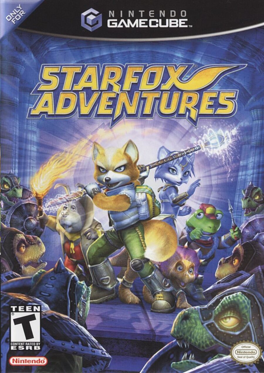
North America / Europe

Like a lot of box art from the GameCube and GBA era, Star Fox Adventures’ western design is more of a realistic composition when compared to Japan’s more abstract design. It depicts Star Fox himself, alongside Krystal, Prince Tricky, Peppy Hare, and Slippy Toad. You could argue that the design is perhaps slightly misleading, since the latter two characters provide remote support from afar, rather than joining Fox on the field, but alas.
It’s a cool design overall, and we particularly like the imposing nature of the Sharpclaw pirates surrounding our heroes!
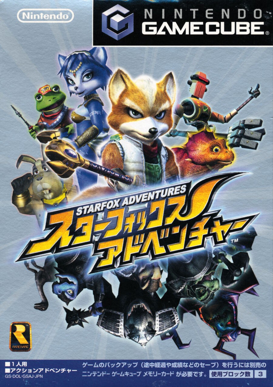
Japan

Japan’s design ditches the traditional background for a sharper focus on the characters themselves, with our heroes facing upwards above the game’s logo and the Sharpclaw army facing downwards. It’s a nice design, though perhaps the grey background itself leaves a lot to be desired. The logo does a lot of the heavy lifting here, but is it enough to clinch victory..? Let’s see!
Thanks for voting! We’ll see you next time for another round of the Box Art Brawl.


