Box Art Brawl: Duel – Mario Kart: Super Circuit

Hi folks, and welcome to another edition of Box Art Brawl!
Last time we took a look at one of the Sega Genesis’ finest games, Castlevania: Bloodlines (also known as Castlevania: The New Generation). It was a close call and it looked like Japan might have run away with the crown, but ultimately, the North American variant – with its bold colours and busier composition – took home the win with 42% of the vote.
This time, we’re going to check out the GBA racing classic, Mario Kart Super Circuit. Released back in 2001, it received significant critical acclaim for its visuals and slick gameplay. For this week’s edition of Box Art Brawl, North America and Europe will be teaming up against Japan, which once again utilises a horizontal landscape for its GBA box art.
So let’s get cracking!
Be sure to cast your votes in the poll below; but first, let’s check out the box art designs themselves.
North America / Europe

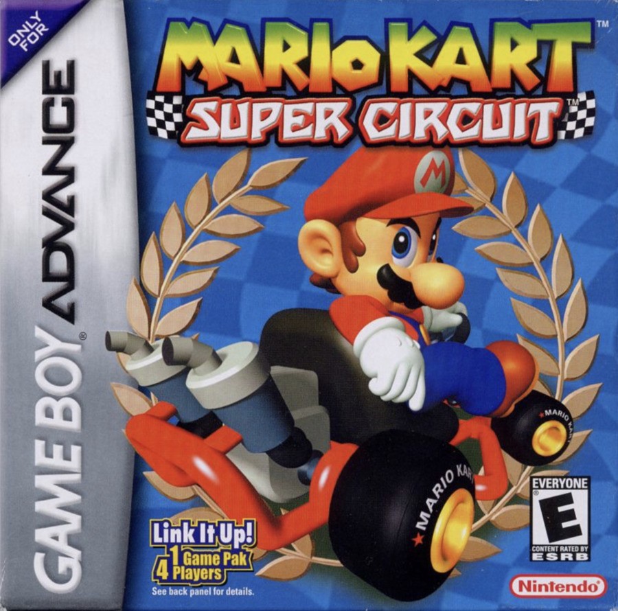
So this is the one we’re probably all familiar with, right? It showcases Mario himself chilling out in his kart, looking back at the camera with a look of, uh… Determination? Seduction? We’re not sure, but it’s a striking image nonetheless, even if it lacks the inclusion of other characters from the game. The blue background is nice and we like the logo at the top, too – nice and bold.
Japan

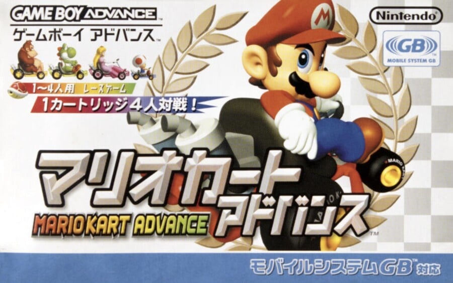
Japan’s cover features the same image of Mario, but the landscape orientation allows for a bit more to be added in, including Donkey Kong, Yoshi, Peach, and Toad in the top left corner. The white background here is a nice contrast to the western design, and the Japanese text is very striking, indeed. We’re kind of glad it wasn’t called “Mario Kart Advance” over here, mind.
Thanks for voting! We’ll see you next time for another round of the Box Art Brawl.


