Box Art Brawl – Duel: Sonic X Shadow Generations
Be sure to cast your votes in the poll below; but first, let’s check out the box art designs themselves.
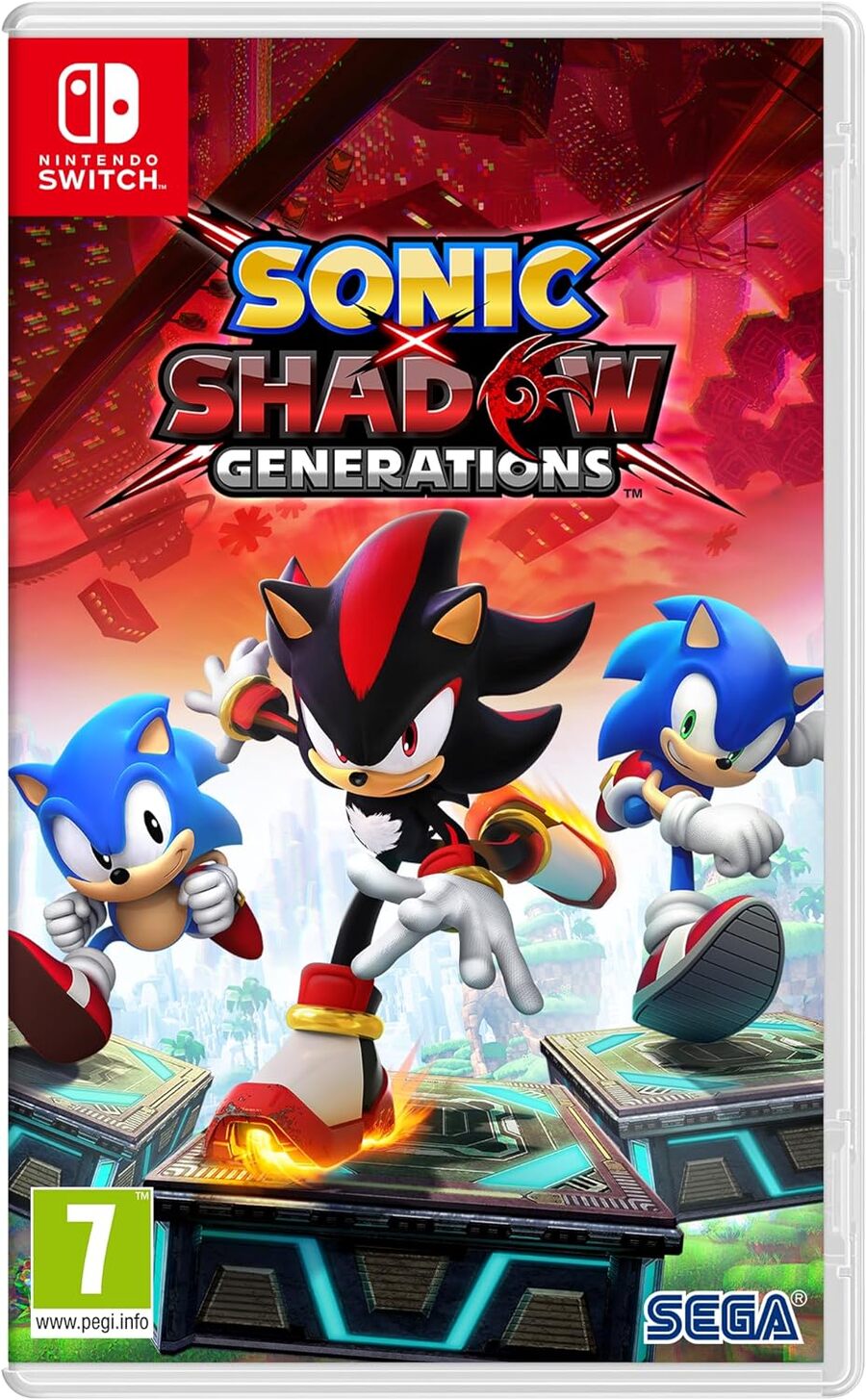
North America / Europe

Okay, we’re sure you will have all seen this Western variant before. Classic Sonic, Modern Sonic and Shadow take centre stage against all kinds of red craziness in the background. Our three heroes look super cool in their running poses and we’re particularly keen on the colour fade behind them.
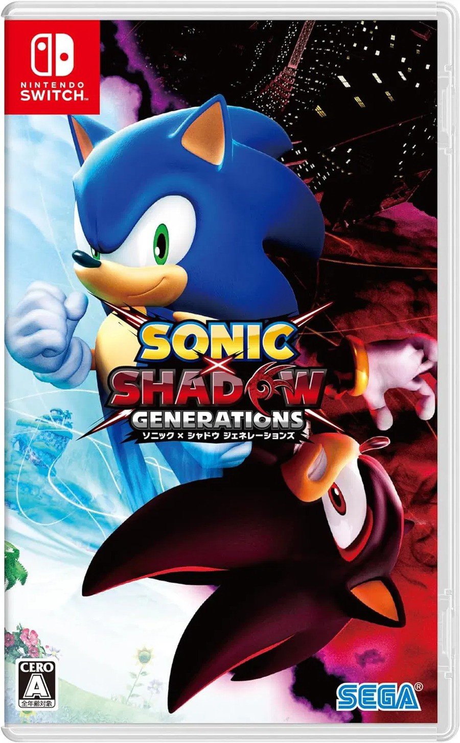
Japan

The Japanese design goes for something different and brings all the Sonic Adventure 2 vibes in the process. We still have our colour split, this time on a vertical divide, as Modern Sonic and Shadow take an almost jin-and-jang pose in the centre. It’s certainly dynamic, and we like the emphasised contrast between the two characters, but it would have been nice to see ol’ Shadow the right way up, don’t you think?
Thanks for voting! We’ll see you next time for another round of Box Art Brawl.


