Box Art Brawl: Duel – The Legend Of Zelda: The Wind Waker

Hello folks, and welcome to another edition of Box Art Brawl!
In last week’s edition, we took a look at The Legend of Zelda: The Minish Cap for the GBA; perhaps one of the most underrated entries to Nintendo’s enduring franchise. Japan once again took the lion’s share of votes with a whopping 76%. Europe came in second place with 14% and North America in third with 9%.
It just goes to show how beneficial the landscape orientation proved to be for Japan’s GBA boxes; there’s simply a lot more space to work with, and this is demonstrated beautifully with the colourful shot of Link surrounded by the Minish folk.
This week, were sticking with Zelda once again to look at what is often considered to be one of the finest entries to the franchise: The Legend of Zelda: The Wind Waker. Released in Japan for the GameCube in 2002 before its western launch in 2003, the follow-up to Majora’s Mask was initially ridiculed heavily for its drastic departure in visual style, with many mockingly referring to the game as ‘Celda’ for its cel-shaded approach.
In the decades since, however, fan appreciation of the game has only increased with each passing year, and there are many (including us) who are simply desperate to see the Wii U’s HD version of the game ported over to the Switch – please, Nintendo!
For this week’s Box Art Brawl, North America and Europe will be teaming up once again due to the stark similarities in their respective designs. While there are differences in tone and colour, the actual compositions are near enough identical. But enough chit chat, let’s get on with it!
Be sure to cast your votes in the poll below; but first, let’s check out the box art designs themselves.
North America and Europe
The western design for The Wind Waker kept very much in line with the series’ gold theme, which was popularised with the launch of A Link to the Past some years prior. With both versions, we can see Link sailing atop The King of Red Lions, though the picture is undoubtedly more prominent in the European version. It’s tough to say which one we prefer as they’re so similar in design, but if pressed, we’d probably lean towards the North American version for its brighter, subtler approach.
Japan

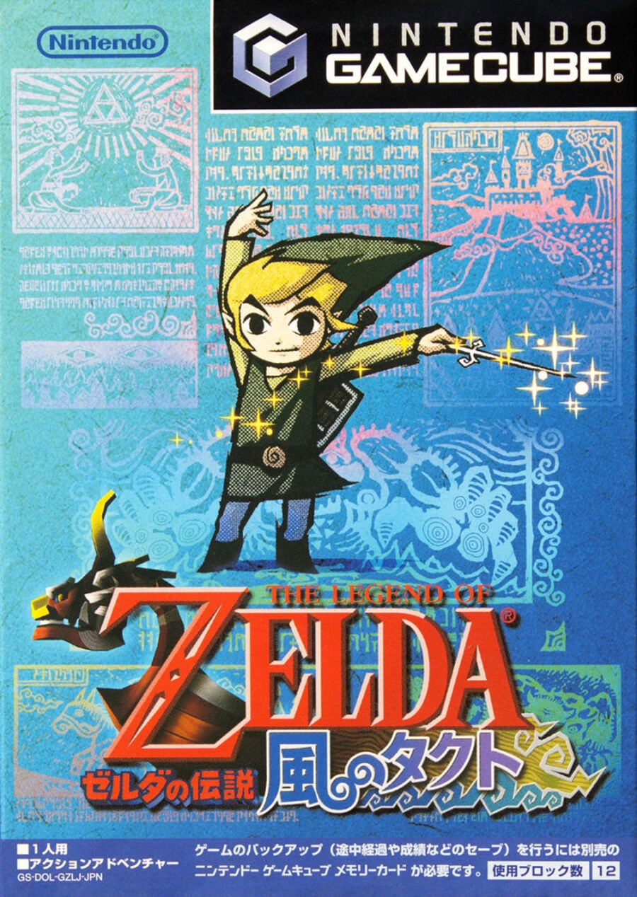
Where the western launch of The Wind Waker demonstrated a more “traditional” approach to its box art, Japan went in the opposite direction and opted for a brighter, more vibrant approach. You’ve got Link himself front and centre waving his little Wind Waker baton around and he’s surrounded by depictions of the game’s opening prologue, including some of the stunning Hylian text. It’s certainly a drastically different approach in design, but we reckon it works really well!
Thanks for voting! We’ll see you next time for another round of the Box Art Brawl.


