Poll: Box Art Brawl: Duel #95 – Earthbound / Mother 2
[ad_1]

Greetings, and welcome to another edition of Box Art Brawl!
Last week, we took a look at the SNES classic Super Castlevania IV, and boy, you folks really didn’t like the Japanese box art, did you? The North American variant took a resounding victory with 94% of the vote; one of the most decisive Box Art Brawls we’ve perhaps ever seen! Hey, at least the game itself is ruddy brilliant wherever you play it, right?
This week, we’re taking at look at Earthbound — or as it’s known in Japan, Mother 2: G?gu no Gyakush? — a game that had a bit of a rough time when it initially released in the West, but has since gained a substantial following. Our very own video producer, Zion, cites Mother as his favourite game franchise of all time, so that’s saying something!
We’re pitting North America against Japan in this edition of Box Art Brawl, because well… They’re the only two regions the game exists in its original form. Have fun with this one, and we wish all moms out there a very happy Mother’s Day (even the ones that celebrate it on a day other than the second Sunday in May)!
Be sure to cast your votes in the poll below; but first, let’s check out the box art designs themselves.
North America

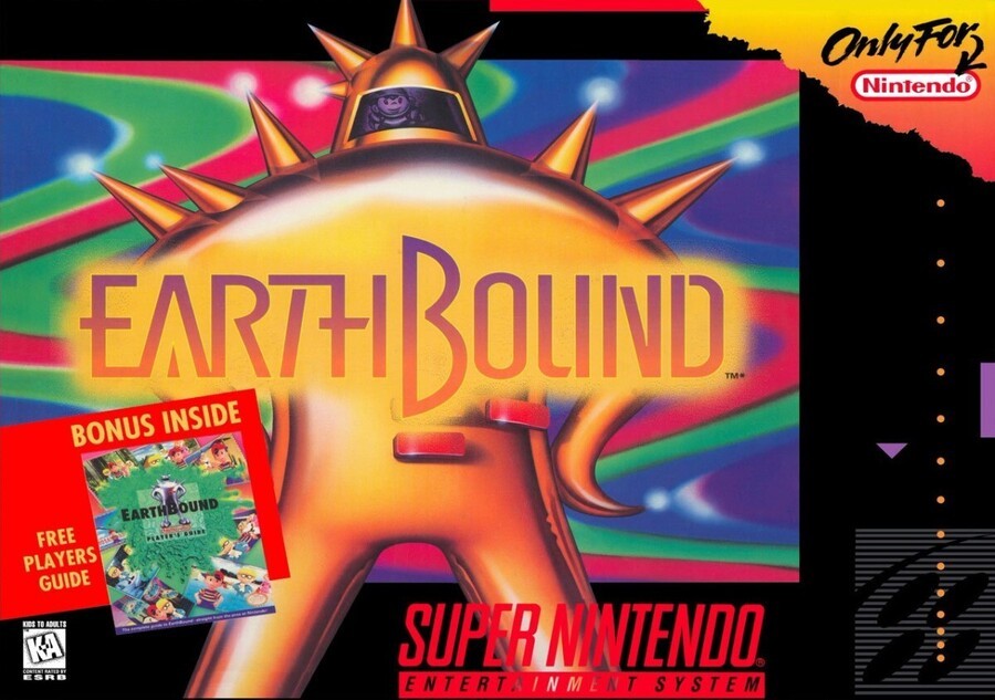
The North American box art for Earthbound depicts the iconic Final Starman, with protagonist Ness just visible within the visor. It’s a colourful, almost psychedelic box art with swirling patterns that resemble the backgrounds during in-game battles, along with a futuristic logo that blends in really nicely with the Starman.
It’s also worth noting of course, that the box itself was significantly larger than other SNES boxes at the time, owing to the inclusion of a strategy guide within.
Japan

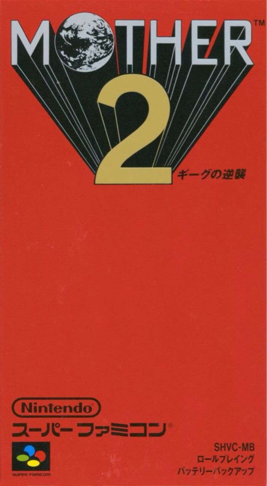
Okay, we’re not going to lie, we love the box art for Mother 2. It’s got a gorgeous, minimal design that definitely reminds us of Square-Enix’s Final Fantasy series. The red background is distinctive, but it’s the logo itself that really draws the eye, with the word ‘MOTHER’ almost zooming out from behind the big number ‘2’ just below, along with the awesome planet in place of the letter ‘O’.
We reckon this one will be pretty close, but make sure to make your voice heard and vote via the poll below!
Thanks for voting! We’ll see you next time for another round of the Box Art Brawl.
[ad_2]


