Designing Deathloop’s Colt & Julianna
Many aspects of Deathloop have gone through changes since we started this project, but through this entire process, we’ve had our main characters, Colt and Julianna, to serve as our guiding lights. From the earliest stages of the development, we knew who we wanted them to be and how we wanted them to act and react. We created their personalities, quirks and flaws. And, of course, we crafted absolutely badass designs for them.
Remembering where we come from
The first thing we think about when starting research on a new project is what we want to retain from our previous titles and what we want to push in other directions. Many people know us for the Dishonored franchise and its unique and identifiable art style. We strive to constantly keep our artistic style evolving and maturing, while still maintaining what makes it unique and “Arkane-y.”
In the case of Deathloop we wanted to keep some stylized cloth and anatomy, but we also wanted to introduce more realistic proportions and push the realism of our anatomy. We want our characters to feel like part of the world. They have a past and carry some heavy stories. Our style aims at highlighting our characters’ personalities, while idealizing certain proportions. We maintain clear shapes and readable lines and avoid visual noise, high frequencies and unnecessary details. We usually invest several months in the early stages of the project into finding the right balance between stylized and realistic when it comes to volumes, textures and materials. We want the characters to be readable from a distance, yet detailed and rich when you get close to them.
Viewing the 1960s through the Arkane lens
When Art Director Sebastien Mitton suggested grounding Deathloop in the 1960s, the idea resonated with the team straight away. We had spent a decade in the Victorian era with the Dishonored series, and this was a refreshing change for the studio. We saw the 1960s as a fantastic playground to develop new visual ideas. However, each of us have our own visual culture and understanding of the 1960s. It took some time and absorbing conversations to grasp how we wanted to design an Arkane take on the 1960s.
We gathered hundreds of references and looked at important figures from the fashion world of the 1960s. Courrèges’ clothing, Pierre Cardin’s vibrant colors, Vidal Sassoon’s distinctive hair styling, and many, many more. We developed some specific types of materials representative of the 1960s, like the glitter material you can see on certain weapons and characters, or the translucent plastic from some of the sculptures present on the island.
The birth of Colt and Julianna
Julianna and Colt were conceived as a stylish fighting duo. We knew from the beginning that the characters would have tons of dialogue and interaction with one another, and we wanted them both to look equally elegant and engaging.
Colt’s primary outfit is straightforward and immediately tells you part of his story. We knew early on that we wanted him to be a veteran pilot from the military. He wears an old pilot leather jacket he cherishes (or he would if he could remember why he was wearing it), and heavy leather gloves. Thanks to his background, he knows his way around firearms and how to behave on a battlefield. Even despite his amnesia, his military-trained reflexes will save his life more than once.
Below you can see an example of an early concept with a bomber jacket, but we ended up going for the leather one that was unanimously loved by the team.
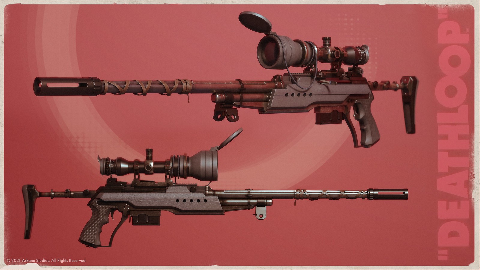
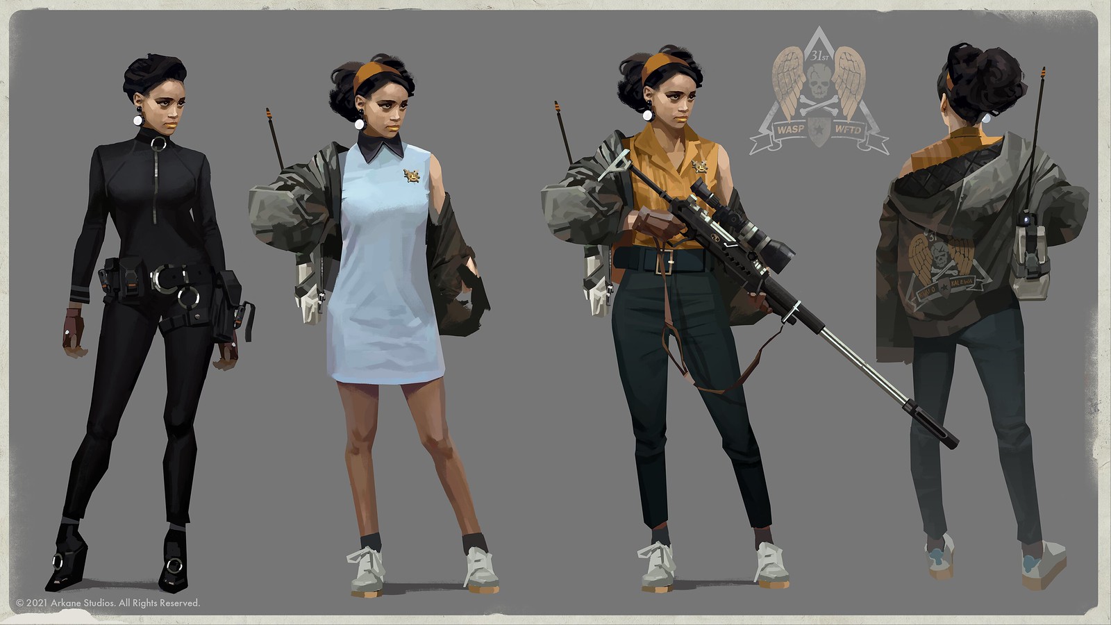
Julianna’s jacket is purposely loose and oversized. She is dressed in tight elastane pants to be free of movement, implying she is fast and agile. The gloves she wears are inspired by archery gloves to evoke the fact she’s a hunter. Her headband and earrings bring some nice pop/60’s elements to her global image. Julianna’s outfit keeps visual noise to a minimum, as we decided to gather most of the intricate details into her signature weapon the Sepulchra Breteira.
Everything tells a story
We believe that every small detail we add to a design has to purposely communicate the situation, intention and action of the character. Every patch, badge and pin on Colt’s jacket has been created in collaboration with the narration, concept and character art teams. Looking at Colt and Julianna in detail will reveal some of their motivations and background. We would like to invite the players to have the pleasure of discovering things for themselves. Here are a few examples:
Jean-Luc Monnet (Associate Art Director & Lead Concept Artist) and his concept art team produced lots of different outfit options before settling for the final ones you see in the game, especially for Julianna. Each one told a story about who these characters are and we liked some of them so much that we decided to use them as alternative outfits for the characters.
For example, Julianna’s catsuit skin reflects the fact she’s agile, athletic and nimble, with a little bit of a Charlie’s Angels vibe. Her blue dress look operates on contrasts: she looks well-behaved and courteous, but she is in fact your fiercest opponent in the world of Blackreef. This duality resonates really well with the way she addresses you. She’s always witty and taking the piss out of Colt. While we didn’t end up using either look for her main appearance, we did pull elements from both.
With Colt’s skins, we designed for a variety of moods. From as a super stylish killer in his Mike Jagger-y pink suit, to the self-tattooed hero that references the memory loss-themed thriller, “Memento.” Like with Julianna, each of his outfits highlights one of his character traits.


