Mega Man, Bandicoot de choque, y gex – Las inspiraciones de los 90 detrás de 'Frogun'’
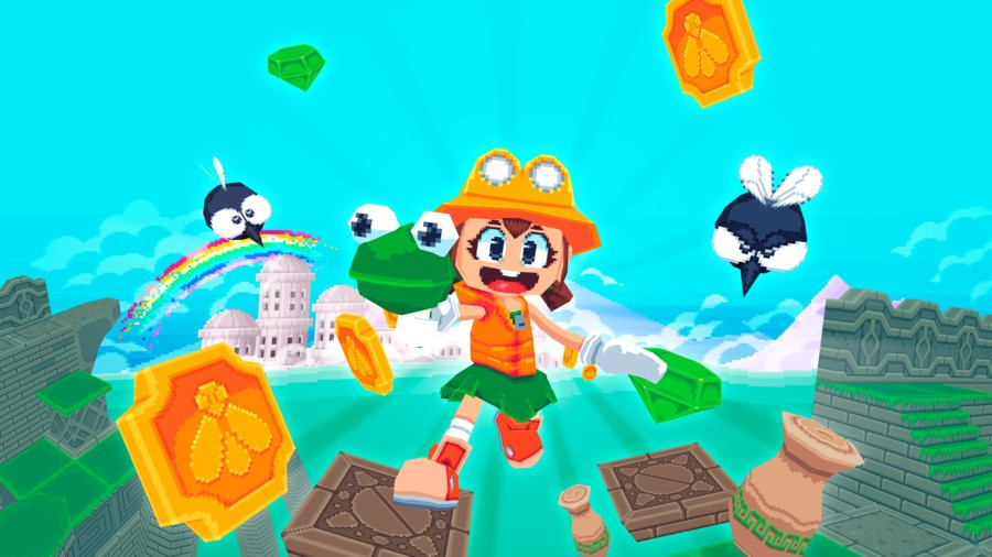
Why is that ’90s and 2000s fashion coming back as a new trend is so utterly distressing to those of us that were there, but ’90s and ’00s video game aesthetics resurfacing is a good thing? We don’t have answers for you, but we do have Rana, a charmingly goofy action-platformer game that combines elements of pretty much every action-platformer between 1985 y 2005.
Whether you were a Banjo Kazooie gal, a Crash Bandicoot lad, or a connoisseur of Mega Mans, Frogun will no doubt grab you by the heartstrings and pull, thanks to its combination of low-poly art with pixel textures and its beepity-boopity 16-bit music.
We sat down (over email) with developer Molegato (Raúl Martínez Garrido) and producer Andy Andi Han to delve deeper into the inspirations (of which there are MANY) that Frogun managed to build on.
What were your main video game inspirations?
Of course I have to start with Bandicoot de choque, specially the second one, Cortex Strikes Back. But the list is long, from modern games like capitán sapo: Rastreador de tesoros o Super Mario 3D World, to classics like Mega Man X. All of them have mechanics or elements I wanted to add to Frogun. Although there’s also how Mega Man Legends was an inspiration for the graphics, or the very first, pixelated, gratis, Spelunky made me love the adventuring explorer theme.
A lot of people have noticed the inspiration from Mega Man Legends in particular – probably because it’s literally the first thing you see, ha – but in terms of gameplay, I think most people probably won’t realize that in terms of the genesis of Frogun’s gameplay style… Mega Man X is more directly responsible! That Strike Chain you get, which can hook in and pull stuff around, or pull you towards stuff? That’s where it all began. Even though it wasn’t very fun to use in that game, it was an interesting idea.
Did you learn anything new about your favourite older games from making one yourself?
Sí! Level consistency is hard, and while some open games like Spyro the Dragon, Ape Escape or the earlier levels of Super Mario 64 tend to have open general-purpose areas, other games make use of every single tile. Bandicoot de choque 4 is a very modern example, but going back to older ones like even the first Super Mario Bros you can see that every 4-block gap, or 2-block column, every small difference on placement counts, and affects where the character can move, jump, or use any action. In a way they’re all like little puzzles.
What’s the hardest part of making a 3D platformer?
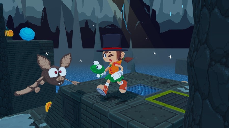
Making sure everything meshes well. That jumps have the right length, that sections are challenging but fair, that there’s no empty space but there’s enough air to breathe. In a genre in which every bit of level design will have as much effect, it’s very easy to make mistakes, and it’s not until you’ve tested it a lot that you can know what works and what doesn’t. A good example of this are the ramp slides you see in certain levels – it took a lot of trial and error to get them into the right position and incline! Prelanzamiento, the ramps actually had different angles and sections of inclines, which meant some of them launched the player at weird angles or distances.
Retro-style games seem to go through cycles. We’ve gone through pixel-art, then N64/PS1-style low-poly, and now we seem to be in the era of PS2/DS graphics. Frogun seems to sit in-between N64, PS1, and DS, PLUS it has frogs, making it VERY trendy. Were you aware of this when you chose the art style for Frogun? Do you think you always would have made it in this style?
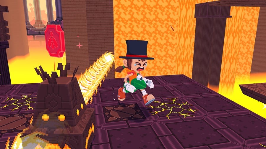
I love pixel art, and low-poly art. So in a way, I chose that style just because I like it. Before Frogun popped up, my main occupation was making low-poly commissions of all sorts. And people seemed to like them, so I decided making Frogun in a similar style. Más, a very blocky game needs a blocky graphical style! And the low-poly + pixel combination allows for some jagged yet cozy results if you play your cards right.
Which elements in Frogun are pulled directly from your childhood of gaming?
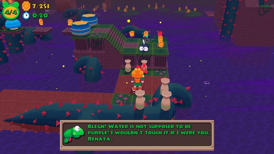
There’s a lot of that. The ruins aesthetic comes straight from Crash Bandicoot, and in the interior ruins levels you can clearly see parallels to the first Crash game. But the grappling mechanic was inspired by the Strike Chain weapon in Mega Man X2, as mentioned earlier. It looked so cool, even if it wasn’t very fun to use in that game.
There’s also some more low key inspirations for the general aesthetics, como Croc Legends of the Gobbos, o Gex, specially the third one, Deep Cover Gecko, o incluso Bomberman Hero. If you have a look round at the environments for those games, you’ll see influences pop up in Frogun, especially in the larger and more complex geometric levels.
Did the “frogun” name come first, or the frog…gun? También, why is it a frog gun?
Frogs are cool, and their sticky tongue is a fun trait. So of course they fit very well with the grappling hook mechanic. A normal grappling hook is cool, but overdone. I wanted to make it cute and fun. También, weird puns and portmanteaus are the peak of humor.
Do your parents get Frogun because it’s based on older games? Did they play games with you as a kid? And have they played this one?
My parents weren’t very fond of video games when I was a kid. I remember that was always a reason for discussion. I wasn’t the most responsible child, and some times I didn’t wait to finish my homework before turning on the PlayStation. They didn’t like that!
They’ve never really been interested in games as you can probably tell, and I doubt they’ll probably ever seriously play Frogun. They at least know it exists though, and I think they’re happy it does!
What lessons can game developers learn from old games – and what do you think old games could learn from modern ones?
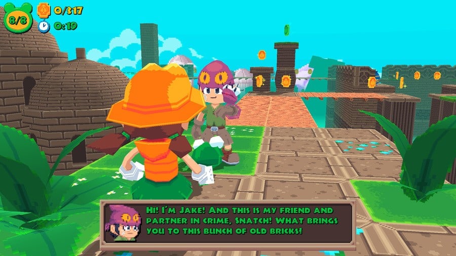
From old games we can learn a lot of things, like being truly innovative, and bold in the design. Being unafraid of making up genres, twisting up the consensus and making something fun without worrying about metrics, established market trends or graphic expectations.
From modern games, old games could learn about accessibility, clarity and streamlined controls and mechanics. Y, por supuesto,, user-friendliness. A lot of old games didn’t attempt to explain anything, and while some took the effort to make things self-explanatory, others just threw new mechanics at the players’ faces without second thought.
Why did you make the decision to combine 32-bit visuals with 16-bit audio? Do you every worry about purists?
Frogun was never aimed to be a purist rendition of a 32-bit game. En lugar, the goal was to encapsulate what we think of, when we imagine one of these games. We think it’s retro, as the low-poly and low resolution are very different from nowadays trends and graphical capabilities. But audio hasn’t evolved as much as graphics since then. The moment consoles could reproduce recorded audio, the gates were wide open. So going one step back in history for the audio helps making the whole experience feel cohesive.
Although like with the graphics, the sound is also more inspired by 16 bit audio than authentic to its limitations. You’d be surprised the amount of music from games like Donkey Kong Country, Mega Man X4, Súper Mario RPG, and even more varied ones came up when searching for references! The final soundtrack is an amalgam of different generations of video games.
How does it feel to have your game out on the modern versions of the N64 and PS1?
It’s like a dream come true. Something I wouldn’t have dared to dream about just a year and a half ago. I really want to thank Top Hat Studios for doing the work porting and programming the game over to consoles, which is what made it possible for the game to be on a Nintendo system and PlayStation!
Do you think your next game will be in the same retro vein? Or do you have other plans?
It’ll definitely keep having low-poly and pixelated textures. Those are just too close to my heart. But of course there will be a lot of differences, demasiado! Just remember what the graphical difference is between Final Fantasy VII y Final Fantasy VIII, or the style difference between Ray man 2 y, for example, Bugs Bunny Lost in Time. This retro aesthetic is a much more open and varied niche than most people realize, and I’d love to explore it all.
Thank you to Andy Andi Han and Molegato for speaking with us, and for sharing their love of retro games.
Frogun is out right now on the Nintendo Switch eShop for $14.99 ($11.99 on sale until August 15th), and there’s a physical edition, demasiado, available through Limited Run Games.
There’s also a patch coming within the next one to two weeks that aims to fix some common issues with the game, like the rival doing damage in races, inverted control and camera smoothing options, and adding more leeway to certain actions like chaining shots. “We’re listening to the feedback we get about the game, and are working hard to make the experience smoother, especially from a QoL perspective,” said Frogun’s producer, Andy Andi Han.
Let us know if you’ve given Frogun a go in the comments, and which retro game (we’re counting anything made before 2005 as “https://www.nintendolife.com/retro”, deal with it) you’d like to see games take inspiration from next!


