


Box Art Brawl – Wave Race 64
[ad_1]
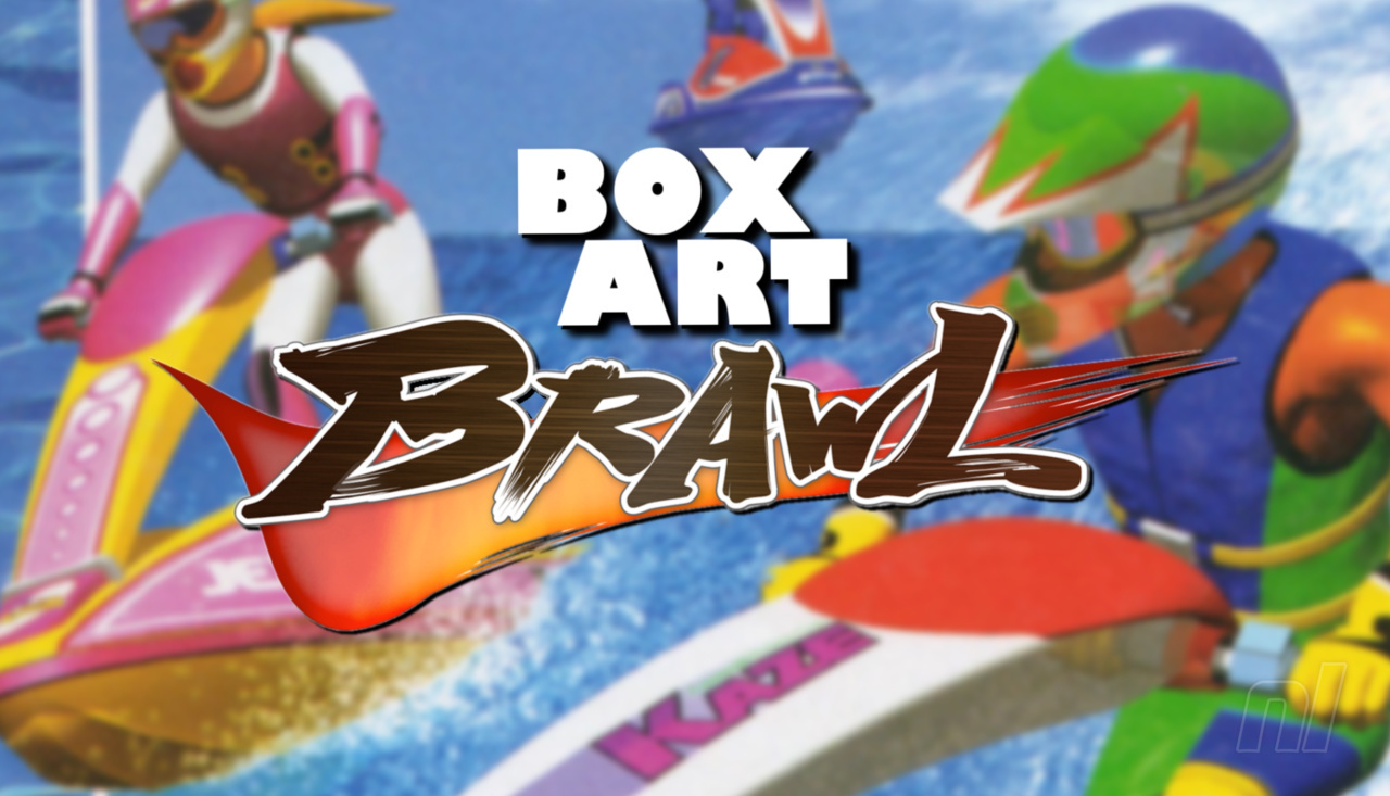
Hello folks, and welcome to another edition of Box Art Brawl!
Last week, we took a look at one of the GameCube’s best and most important games: The Legend of Zelda: The Wind Waker. It was a pretty close race, too! North America and Europe teamed up to take on Japan, and although many loved the traditonal golden aesthetic of the game’s western release, a few more preferred Japan’s more vibrant, abstract approach.
In the end, Japan took home the trophy with 54% of the vote. This week, to celebrate the launch of Wave Race 64 on the Nintendo Switch Online + Expansion Pass service, we’re going to be gunning for a traditional three-way brawl to find out which region got the best box art design for the classic N64 title.
Wave Race 64 is one of the most celebrated N64 games out there and is still greatly appreciated by racing fans to this day. Unfortunately, however, the Wave Race franchise has been very much dormant since the GameCube era, much like its cousin F-Zero. The launch of Wave Race 64 on the Switch’s Online service is certainly a step in the right direction, but we reckon it’s high time we got a proper sequel to 2001’s Wave Race: Blue Storm!
Be sure to cast your votes in the poll below; but first, let’s check out the box art designs themselves.
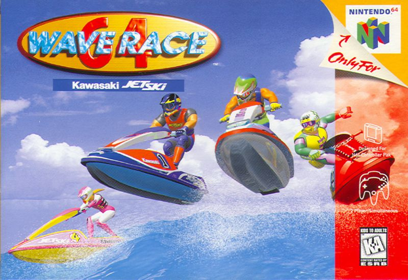
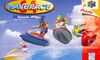
North America
North America and Europe got pretty identical designs for their respective box arts, but we reckon the overall composition is different enough to warrant separate entries this week. The image itself focuses on four racers as they effortlessly leap over a wave; it’s simple, straightforward, and epitomises the term ‘cool’.
However, one major complaint we have here is that it all looks a tad cluttered, with the large logo in the top left corner along with the opaque red banner going down the right hand side. Bit yucky.
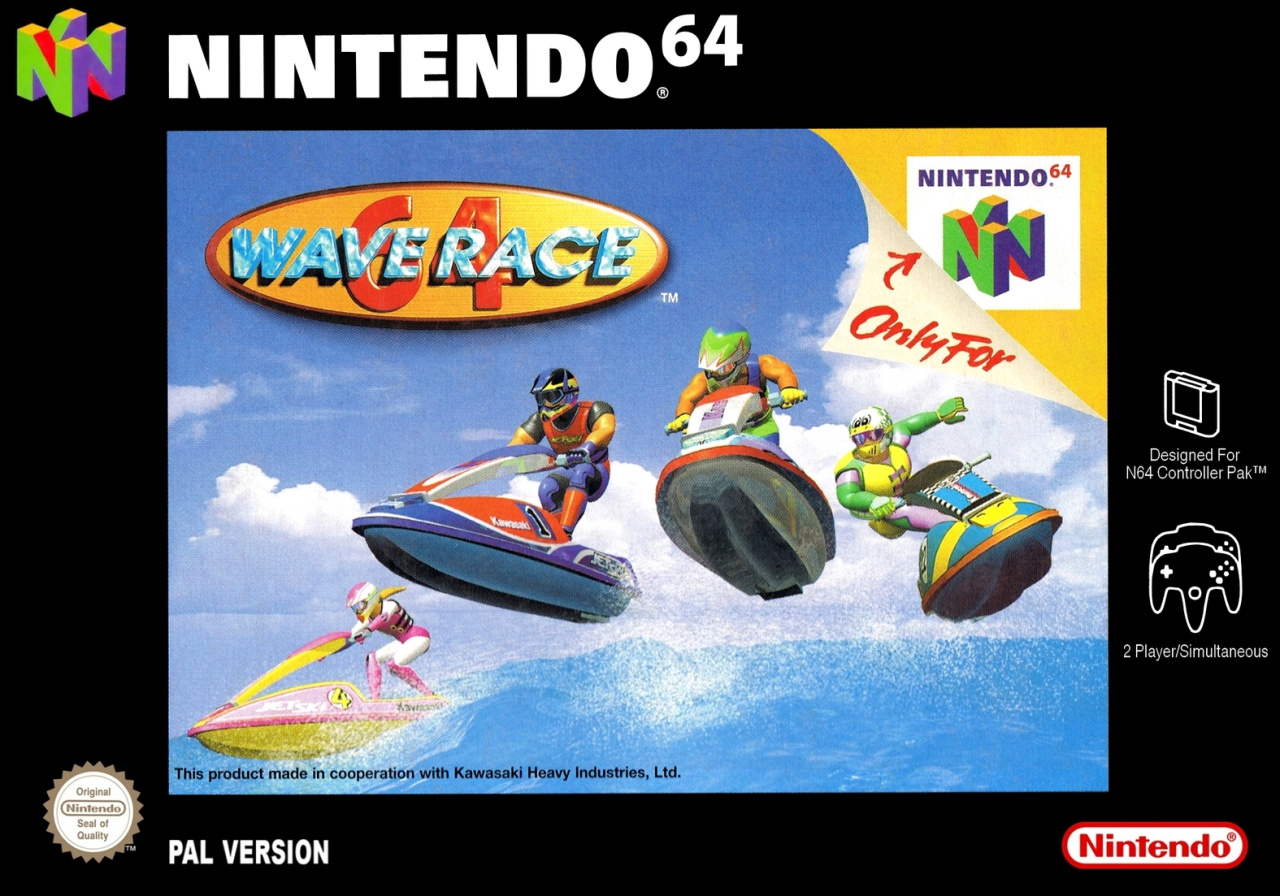
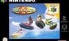
Europe
Okay, so Europe’s design is identical to North America’s, but the image itself has been shrunk down to allow for the black border around the edge; which would be fine, of course, if it weren’t for the garish “Only for Nintendo 64” branding stuck on the actual image itself! We’re not quite sure what the thinking was behind this, since there’s a lot of empty black space in which such branding could have been utilised, but never mind.
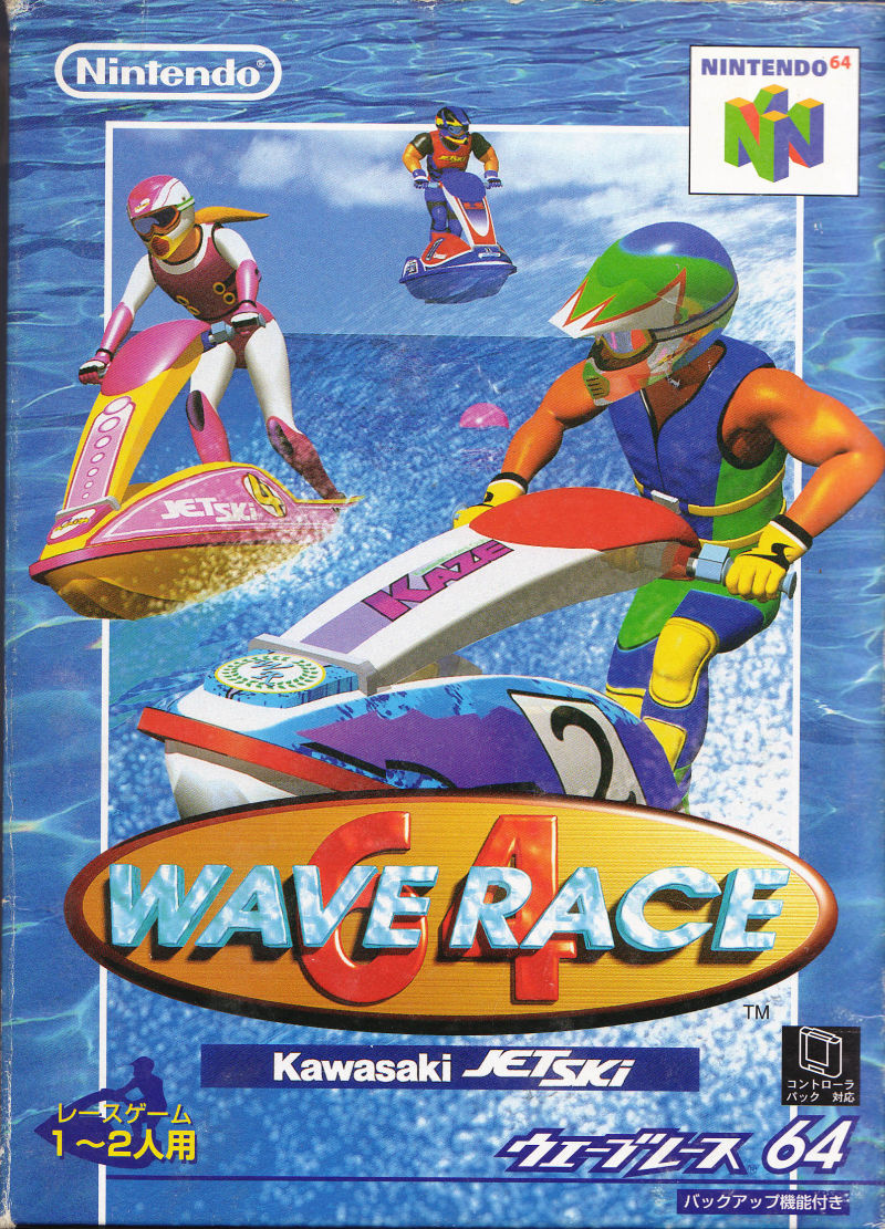
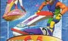
Japan
We’ve a feeling Japan might just run away with this one. Look at it! The composition is instantly more eye-catching, with bigger images of the racers and no overly-intrusive branding getting in the way of the action. We love how it effectively sticks one image on top of another too, with the background consisting of ocean water to make for a vividly colourful display. Nice!
Still, it’s your vote that matter here folks, not what we think! Make sure to leave a comment too and let us know which one you prefer and why.
Thanks for voting! We’ll see you next time for another round of the Box Art Brawl.
[ad_2]