Poll: Box Art Brawl: Duel #93 – Kirby’s Dream Land

Hello everyone, welcome to another edition of Box Art Brawl *cue stadium-sized cheer*!
Last week, we looked at the classic, the incomparable, the ruddy good video game that is The Legend of Zelda: A Link to the Past. Pitting the US box art against the Japanese box art, you fine folks were quite clear in your preference for the more classy, understated design of the US version. With its gold background and iconic logo design, it pulled in 65% of the vote – well done, golden boy!
This week, we’re taking a peek at Kirby’s Dream Land for the Game Boy. The franchise is currently celebrating its 30th anniversary, so it’s now officially old enough to wrinkle its nose at modern culture and long for the “good ol’ days”. We’ll be pitting the European box art against Japan this week, so strap yourselves in for the fight of the century week!
Be sure to cast your votes in the poll below; but first, let’s check out the box art designs themselves.
Europe

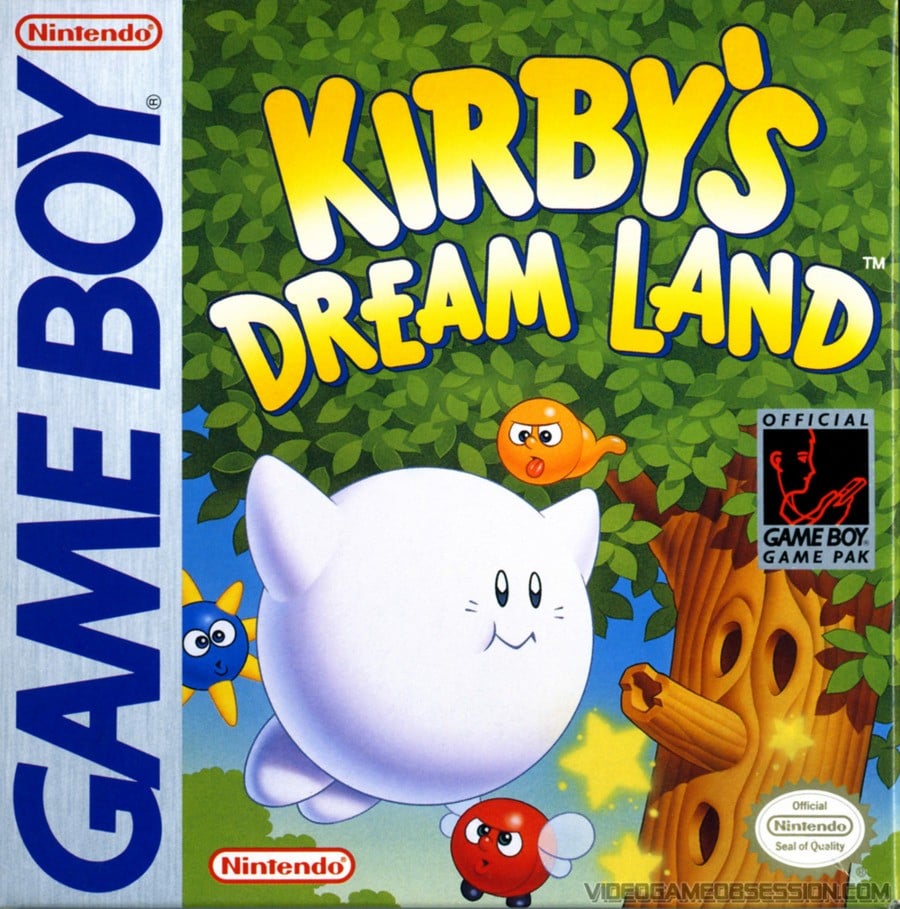
The European box art for Kirby’s Dream Land features our main guy doing his floaty thing, with Whispy Woods in the background. There’s a lot of colour going on here, but you might notice that Kirby himself is looking a bit pale. As the story goes, Kirby’s final colouration couldn’t be determined by the time localisation started in the west. In the end, Kirby’s colour on the box art matches up with what the character looks like on-screen, because that’s really all they had to go on! He’s looking more like Kirby the Friendly Ghost to us.
Japan

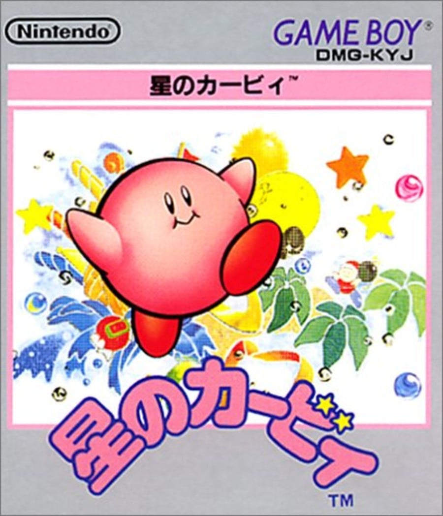
Japan’s box art depicts Kirby as we know and love him: round, pink, and squishy. Like many of Japan’s box art designs from the ’90s, the artwork here is a lot more understated and abstract than the western design, with watercolours bursting from the image. In terms of what it actually depicts, there’s not a lot to go on here; after 30 years, we know what Kirby is and what the games are all about, but if we saw this back in ’92, we’d probably just think “eh??“.
For us, we’re honestly a bit torn as to which box art to go for, here. The European design is a lot clearer and marketable, but Japan’s just looks cool, man. Yeah, we can’t choose… You do it for us. Vote!
Thanks for voting! We’ll see you next time for another round of the Box Art Brawl.


